 Remember when video games had these cool pictures on the cart or disc and just made it seem so much cooler? Look how cool that is! We've got a dude in green spandex and his wristband has this light coming from behind it and he's got on these slick rayband glasses and there's a beast man there, looking like he's going to attack you and there's this hot blonde chick who's like pointing to the game's title like she's Vanna White. Corny sure, but I was so pumped to throw down some Eternal Champions when I first saw this. You would pop this into your Sega Genesis and that image would be sticking out of your console, not only letting you know what you are playing but also giving your console style. You would leave the game in the cartridge slot because it looked so cool presenting the Genesis to you room. We don't have that luxury now because discs are always inside the console but that doesn't mean we don't like disc art.
 Now we get game discs that look like this. Check out that cool black background. Completely black, any kind of embellishments be damned. The title of the game is right there on the bottom and hey, there's the ESRB rating right there on the side. The other side has the company logos and a bunch of text no one cares about. That's so great. Also, we all love that Xbox 360 marquee on the top. Yeah. What the ass is this? It is completely barren of any design whatsoever. I know I don't have to be constantly looking at it but come on. They clearly didn't even try. Can't we get a cool design like Bond pointing a gun at us with the gun barrel being the circle in the middle? Or a picture of Bond hiding behind something while a guard goes by? Maybe just a screenshot from the first level? Something! Also, I hate these marquees discs have now, especially the Xbox 360 one that goes with nothing. Several different shades of bright green and a white background. Lovely. The Xbox 360 logo should just be placed somewhere on the disc.
 Here's an older game on a disc. Even this game bothered to have an interesting design in the back though they still put the text we don't care about. Also, there's no annoying marquee on the top or bottom that takes up a fifth of the disc real estate. Whoa. They're all schewed and there's a bright light in the back. It's liked there going back in time! They are! That's why they're all warped! Oh snap! That's the title! Okay I'm exagerating but it's still more interesting than most games released today.
 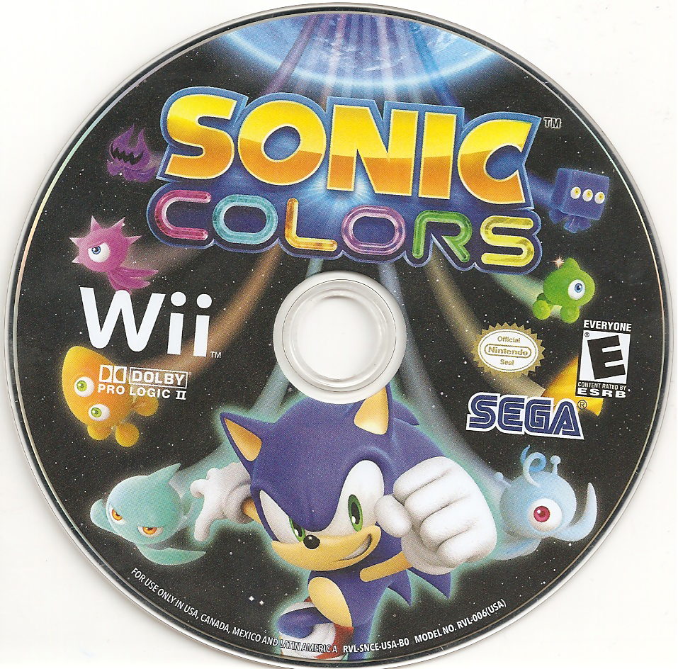 Sure there are some exceptions.
This other game is really comfortable and the Wii logo is just on the side and there's no block of text anywhere. I can see that it's Sonic and he has some crazy alien things behind them and there seems to be a space motif. Cool! Let me give this a try.
Bottom line, disc designs aren't that interesting anymore and I miss that. How do you feel about disc designs and disc art? Do you miss it? Do you think it's still around? Do you not give a crap? Also, do you have a favorite? Comment and let me know.


Comments